… or ‘What it means to be a mural-painting classicist’
This week I’m delighted to have been accepted as a Fellow of the Royal Society of Arts (more fully the ‘Royal Society for the Encouragement of Arts, Manufactures and Commerce’, but commonly known as the RSA), following in the footsteps of Charles Dickens, Karl Marx and Bob Dylan (and wouldn’t that make a great fantasy dinner party…!). The RSA is a charitable organisation dedicated to social change through creativity, with a mission ‘to create the conditions for the enlightened thinking and collaborative action needed to address today’s most pressing social challenges’. Cue some enlightened thinking…
I’ve recently been inspired to reflect on how creativity – in my case, conspicuous creativity using other people’s walls! – has shaped my approach to teaching and learning today.
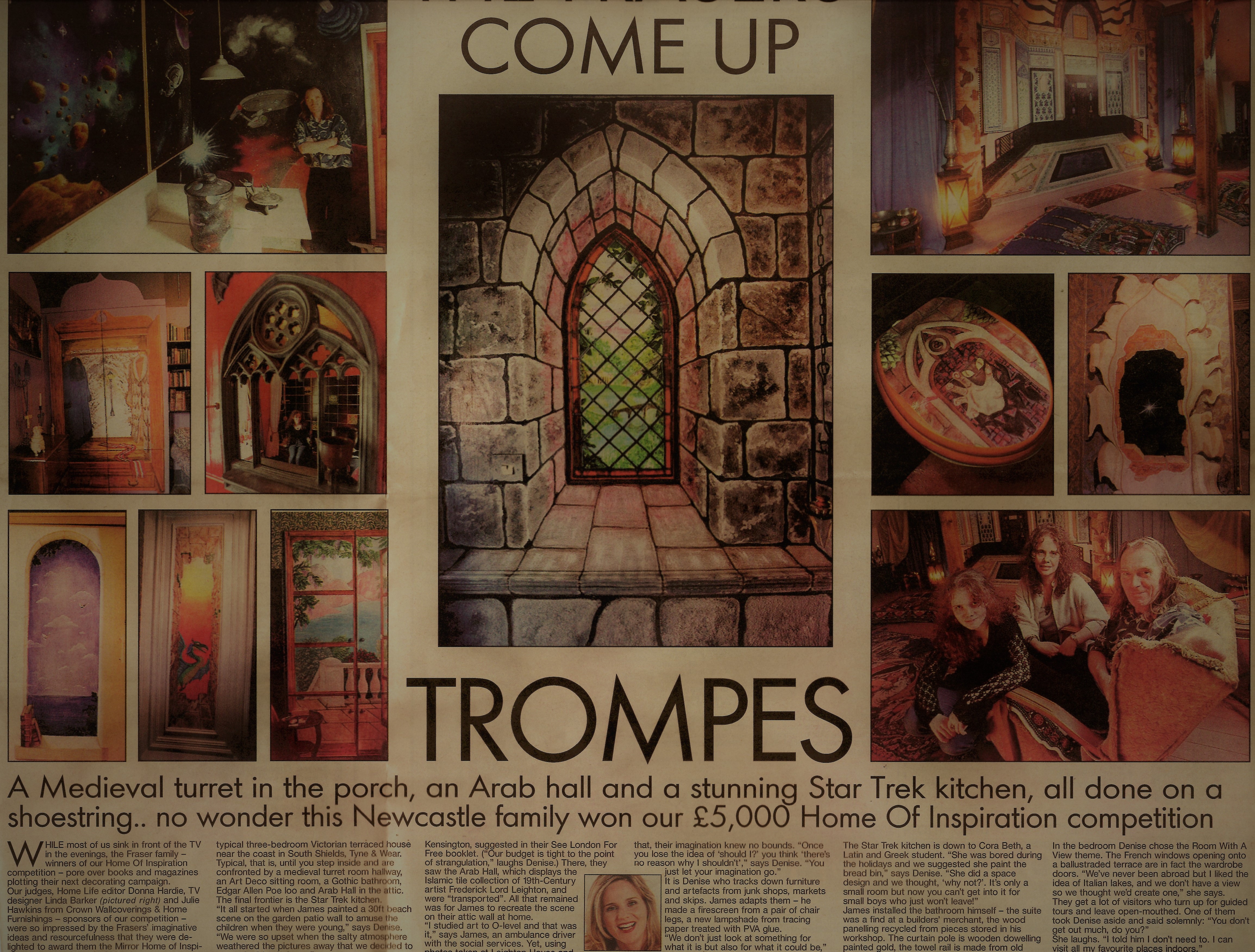
For me, Classics is inseparable from Art, because of the way my early career developed. While studying Latin and Greek at university, I was also working with my father as a mural painter, as a way of financing my degrees. The mural-painting sideline developed quite naturally out of of my parents’ interest in interior design, which led to our home winning numerous competitions when I was an undergraduate (see the Media Gallery below). My mother was the creative genius behind the award-winning ideas; my father and I taught ourselves to paint so we could carry them out on a shoe-string budget!
Over the course of several years we came to specialise in the type of mural often called trompe l’oeil, where something about the painting tricks or confuses the eye. We would paint a window in a blank wall, or a doorway leading to somewhere bizarre; sometimes we would paint a whole room in a traditional style but would add a painted penny on the floor so that people would try to pick it up. Trompe l’oeil is a type of visual joke; it can be amusing, playful or even unsettling. It also allows people (painters, or those who commission a painting) to use their environment to control the viewer’s response. Because trompe l’oeil subverts the viewer’s expectations, there is a strong emotional component to the reaction, ranging from comfortable recognition to startled realisation.
A selection of trompe l’oeil paintings produced by my father and myself between 2000 and 2010. Castles were a particular speciality!
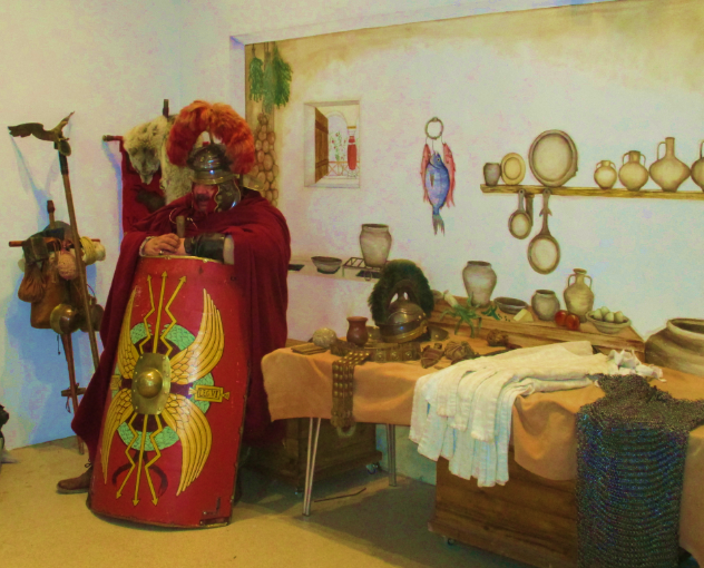
While most of our mural-painting commissions were in houses, shops and restaurants, we gradually started to move into the Museums sector. We took on a number of commissions from Tyne and Wear museums, ranging from painting endless wooden panels for the touring ‘Tudor Lives’ exhibition to creating the trompe-l’oeil backdrop to the Schools Resources Room at Arbeia Roman Fort. It was always a pleasure to combine my work in Classics with my painting commissions. It also afforded me an interesting opportunity to draw visitors into a historical environment by means of visual tricks. The kitchen at Arbeia Roman Fort is an example of this. It is housed in a reconstruction of the Commander’s House, so the whole environment is set up to draw the viewer into the Roman domestic world; but trompe l’oeil offers the opportunity to include visual quirks, like a view of the real courtyard through the window, and a mouse on the floor who looks suspiciously like Minimus! These little visual jokes, when spotted, can give the viewer a feeling of recognition and familiarity which personalises the experience and makes an emotional connection between the person and the environment.
Arbeia Kitchen Alcove, from start to finish. Undoubtedly the coldest job we’ve ever done: it gave me a great deal of sympathy for those poor Tigris boatmen stuck on a bleak and windy hill during a North-East winter!


For a few years I taught Art in various community settings, ranging from primary school workshops to a Fine Art class for women from Bangladesh who didn’t speak English (I picked up quite a lot of Bengali during that course!). I also offered my mural-painting services, at Christmas time, to local primary schools in need of a nativity backdrop; teaching children to paint on a large scale was messy, but entertaining!
It wasn’t long before my Art work began to influence my Classics research. A stint working as a graphic designer for a chain of tourist shops saw me designing chess sets of great historical confrontations, supported by primary source documentation. When designing the ‘Boudicca against the Romans’ set I felt confident that I could find plenty of descriptions of the protagonists in Tacitus – but Tacitus let me down! Tacitus, as it turns out, tends to avoid visual description, and is of very little use to the aspiring chess set designer. This didn’t fit my expectations at all – and when I was given the opportunity to do a PhD in Classics, my goal was to find out why Tacitus avoids visual description, contrary to his reputation for a particularly vivid style of writing.
My focus on trompe l’oeil in my painting also made me alert to visual jokes within literary texts, leading to the publication of ‘Otho’s Funny Walk‘ in The Classical Quarterly, and to a number of more bizarre theories which remain unpublished!
Design and Teaching
All the years of experimentation with trompe l’oeil had an inevitable effect upon my approach to teaching as well as research. Throughout my career I have championed the importance of design in teaching materials – a handout should always be visually striking as well as full of useful content! – and more recently this has had an impact on my approach to online teaching.
Visually striking content tends to make material more memorable – and in an online teaching situation, this is very easy to achieve. Use of colour (sensible use of colour!) can make text easier to read for students who are dyslexic or partially sighted, so backgrounds are important.
Researching image and design feeds into how I have developed my teaching materials, through visually striking content (see below). I have made a lot of teaching materials freely available online on my website, both for the use of other tutors and for students to use as self-study materials, and I have developed similar visual resources to be made available to other tutors on module websites. However, my interest in visual design goes beyond teaching materials; it also informs my perception of online environments.

Online rooms and an unusual take on “interior design”
Across different platforms and systems, the notion of the online “room” persists: many synchronous set-ups have a “whiteboard” like a physical classroom, and there are usually functions which allow users to “raise hands” and to convey facial expressions by clicking an icon. These features convey a sense of familiarity, and even an equivalence with traditional teaching and learning contexts; yet this explicit connection is not without its problems. In a real room we expect to be able to see people and their expressions, whenever we want to (and not just when they choose to signal something); we derive clues about appropriate behaviour from the physical layout of the classroom and the position of the teacher in relation to the students; and we can be inspired by what we see around us, like posters on the walls and books on the shelves. None of these environmental cues is usually seen within the online “room”; but we persist in talking about room-like features, because the equivalence still matters to us. We intuitively relate to these “comfort cues”; they put us at ease, and even in a digital world they still matter to us – more, perhaps, than we realise.
This need for a sense of physical familiarity or equivalence links to the idea of embodiment, into which much research has been done over the last decade. Pseudo-physical cues offered by online “rooms” provide an anchoring mechanism for the learner’s sense of self, and by extension, ideas of rooms and “home” spaces can be associated with safety and security.
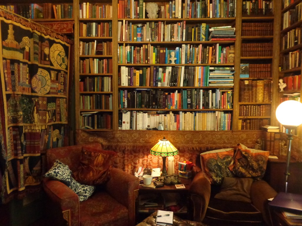
Over the last three years, while studying the MA in Online and Distance Education, I have become interested in how online rooms reflect real rooms, and especially in the geo-phenomenological exploration of space and the affective meaning of place. Recent research suggests that an online “space” is abstract and can lead to participants feeling disconnected or lost, unless participants do something to change that “space” into a more realised “place”. With my background in turning a blank wall into an imagined place, this was a problem which was bound to attract my attention!
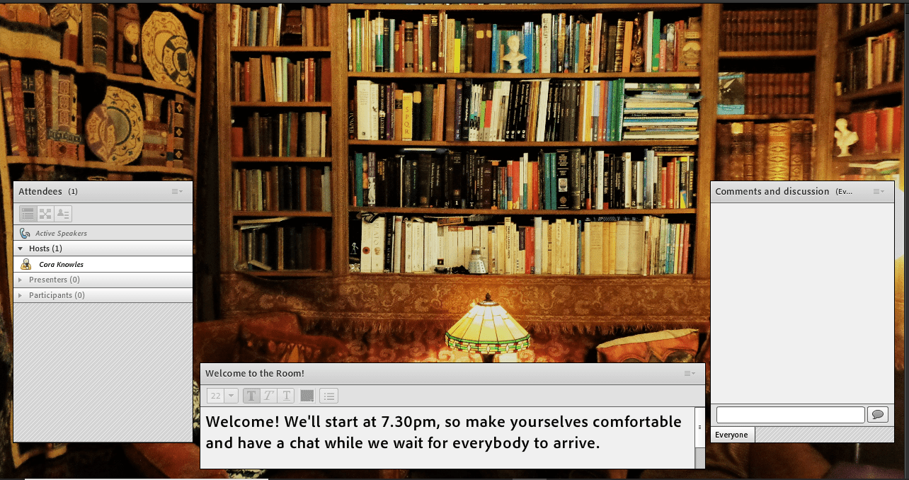
The sense of being lost in an abstract space is something that I have attempted to tackle in my own use of online rooms, through visual images. Most recently, the facility which Adobe Connect offers to set a background to the movable chat and presentation windows has given me the opportunity to experiment with the ‘affective meaning’ of different background images. Through trial and error I found that stock background images had little effect upon student engagement. However, trompe l’oeil pictures giving the impression of a realistic study environment proved to be a talking point. They give my online “room” a welcoming feel to which students respond.
I have begun to use photographs of the bookshelves in my own study as the background to the online “room”. Giving students a “guided tour” of my book collection (including the module books and set texts which students have on their own shelves) has been an entertaining ice-breaker for the first session of the module. Using the same image in subsequent sessions helps students to feel that they are stepping into a friendly and familiar environment in which they can chat without feeling disconnected.
Research and Training
I have been working on encouraging other tutors and trainers to give more thought to the online environment, through providing useful trompe l’oeil images to use as backgrounds. This is an area in which I intend to do further research, because it has the potential to make a real difference to the quality of the student experience with very little work on the part of the tutor – so watch this space for updates!
Recent Art Projects
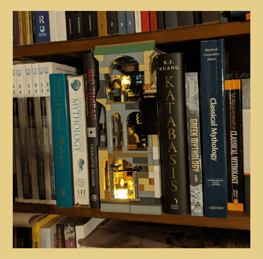
While my current goal is to research trompe l’oeil and its role in teaching and learning, I do still paint walls; there are a few left in my house! Recent projects include the Impossible Library, a visual wish-list of books which once existed, but which have been lost to us over the centuries.


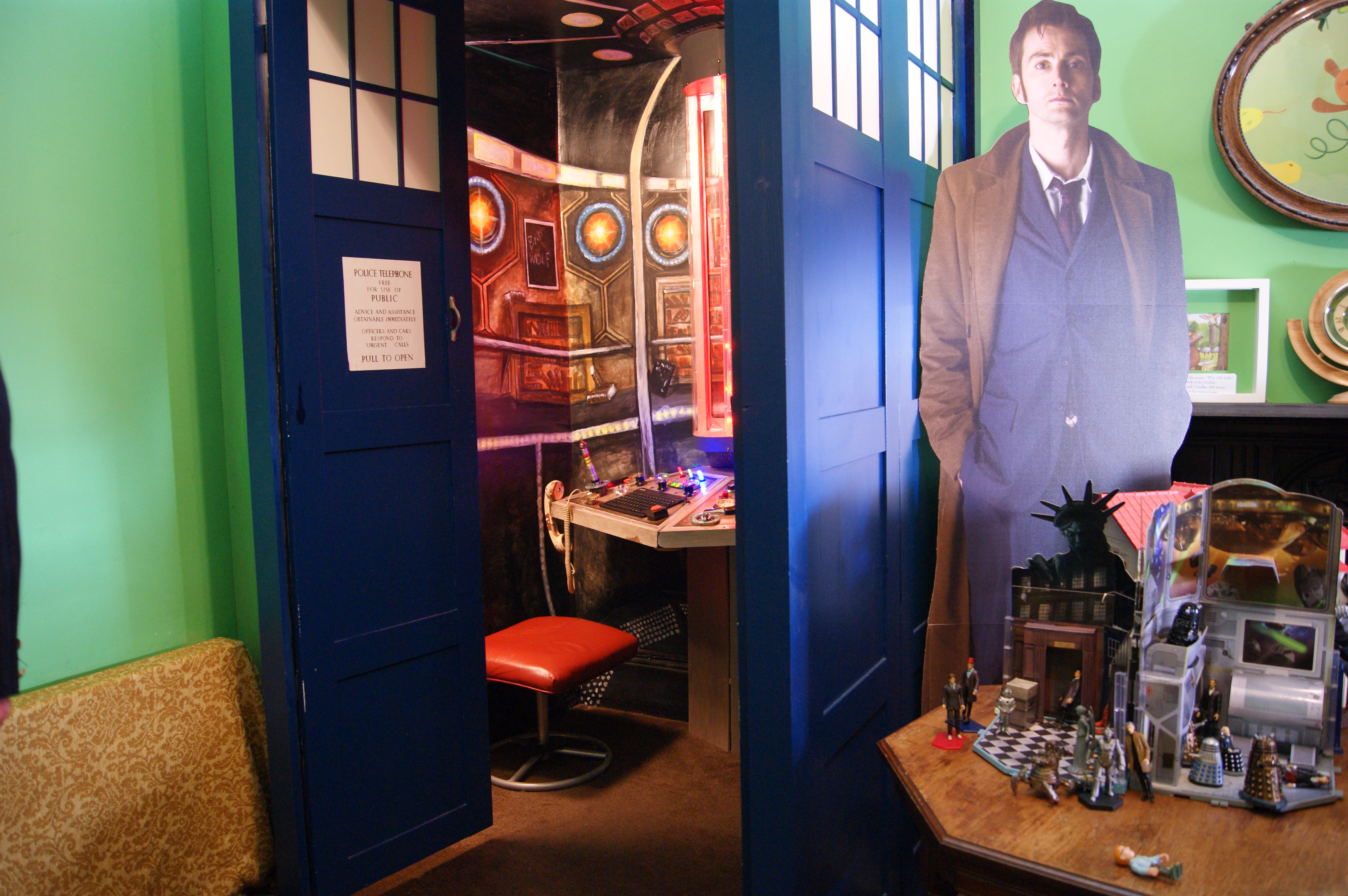
Not all my projects are classical, however; last year we built a part-constructed, part- trompe l’oeil Tardis – because who doesn’t want their very own Tardis…?!

Media Gallery


Our murals were also featured in the book No Place Like Home:

Free to download
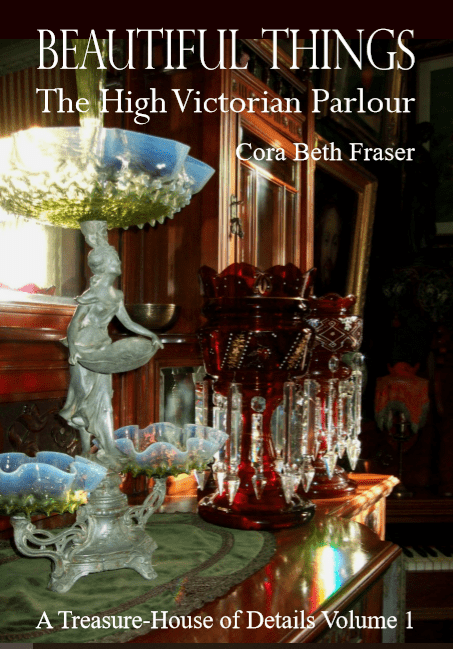
Here you can download Volume 1 in a series of books on the history of British interior design, written by me and based on my family home. This volume focuses on Victorian interiors – with lots of pictures! Volume 2 looks at Art Nouveau and Art Deco in the home, while the rest of the volumes… well, I haven’t gotten around to writing them yet, but they’re on my to-do list!
Click the link below the cover image to download the Volume 1 ebook as a pdf. This file is big, so it might take a while!
BeautifulThings, by Cora Beth Fraser